Website design is becoming increasingly nuanced, so how do we as designers and developers stay current with UX/UI trends?
Let’s dive into the trends we see continuing in 2022.
5 UX Trends
Password-Less Authentication
Who hates constantly coming up with new passwords or trying to keep track of fifty different variations of the same password?
Of course, there are tools to LastPass to help you keep track, but the problem could be resolved by removing excessive passwords completely.
Many websites have adopted complex password-setting protocols that oblige users to include special characters, numerals, or upper and lower case characters. In the end, users are more likely to forget the combination of characters included in the password; hence, are more likely to reset their passwords often.
Statistics show that about 27.95% of users forget their passwords more than ten times a year, according to a Password Security Survey by Cyclonic. Forgetting a password is among the many UX pain points that often erode the overall UX of website visitors.
A simple solution is adopting “password-less authentication” protocols, including logging through social media accounts, biometric, iris scans, phone unlock patterns or Google authentication.
Many big brands are already adopting this trend, including Microsoft, whose Windows 10 version features a biometric sign-in option. Other brands leaning into this trend include IFTTT and Medium, which offer users an option to log in using Google.

Dark Theme/Dark Mode
Dark themes alter the brightness and contrast levels of a website’s UI design to make it visually appealing and soothing for the eyes day and night. A study by Purdue revealed that switching to dark mode at 100% brightness can potentially save about 39%-47% battery power.
iOS and Android are examples of brands already offering dark themes and have influenced many apps towards embracing this trend.
Dark modes are beneficial, including saving battery on OLED and AMOLED screen devices, providing better text readability, reducing eye strain when using a device at night, and reducing screen glare and blue lights.
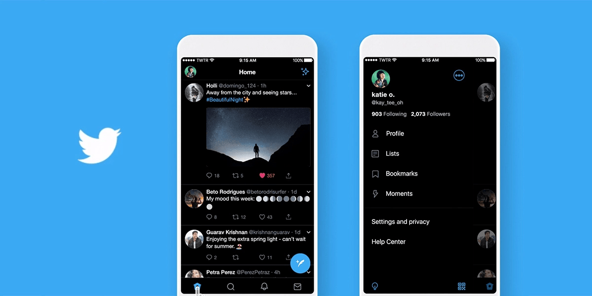
Twitter is another example of a brand that has embraced the dark mode UX on its app.
Micro-Interactions
Micro-interactions stem from the trivial moments users and a website or app designs interact to deliver a more engaging experience. The objects on a website are animated to make them appear more alive.
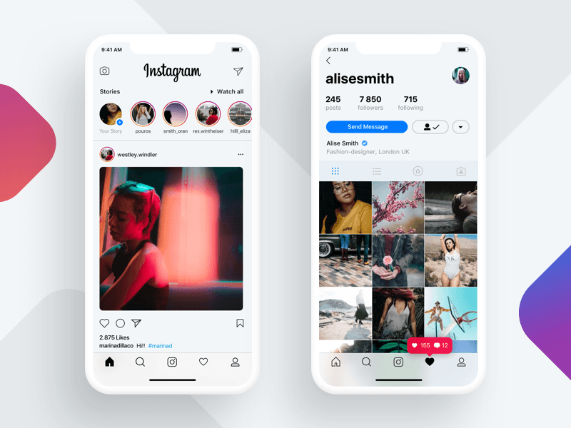
These micro-interactions are embedded in every software application and users use them every time. Examples of micro-interactions include the ‘Like‘ feature of Instagram and ‘Retweet‘ of Twitter.
Other advanced micro-interactions like touch-less controls and gestures help designers to craft more intuitive experiences. The image below shows how Instagram embedded micro-interactions to improve its UX design.
Research findings suggest that adding micro-interactions to UX design can bring positive light, leads, and much-needed conversions.
Microcopy
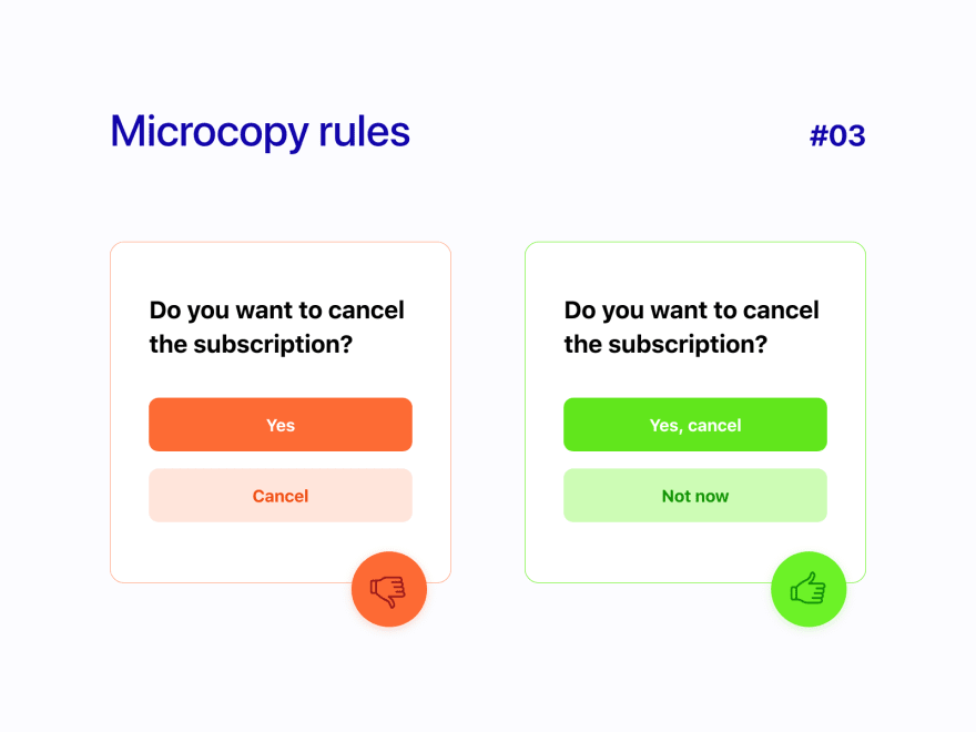
Microcopy refers to the little sentences and paragraphs that appear on the internet, on the website, in almost any app, or on a product. These messages can include error messages, pop-up menus, captions, buttons, and loading, and error pages.
However, excellent and unique microcopy stands on its own and has the ability to inspire people, earn their confidence, and empower them. In this regard, a successful microcopy must make a statement and have a considerable effect.
Google is an example of a brand that has used microcopy to boost engagement. The brand changed the microcopy of the Hotel Search by changing the text of the label ‘Book a room’ to ‘Check availability.’ This minor tweak increased engagement 17%.
Virtual and Augmented Reality
Virtual and augmented reality provides numerous opportunities to innovate and create exciting experiences, especially in the gaming industry. According to research published by Vibrant Media, an estimated 67% of media planners and buyers intended to incorporate more AR/VR ads into their campaigns.
According to research, many AAA games are coming to VR platforms and the UI design for AR is poised to be a significant trend in 2021 and onward.
Valve is an example of a brand that is leveraging this trend and recently released an augmented and virtual reality-based game Half-Life: Alyx.
5 UI Trends
2D/3D and Custom Illustrations
Digital or hand-drawn, 2D or 3D, custom illustrations, including the free forms, unaligned elements, components, and vast asymmetry, make websites stand out from the generic while establishing a friendly and inviting environment that ensures a better experience for the users.
Research shows that brands that used 3D animations to market their products and services increased sales by 40%. Equally, the report notes that 81% of visitors highlight 3D video animations on the brand website.
3D imagery continues to excite humans while trending in UI design. Developers have many tools at their disposal to easily create stunning 3D graphics and illustrations for UI design. Moreover, some websites have adopted 3D animation on full screen to provide the user with an immersive experience. An example of a brand leveraging this trend is Plink.

Glassmorphism
Here’s a blast from the past.
Glassmorphism was widely used in the past on Windows Vista and iOS 7, but the design trend is coming back to the market. The design includes embedding a frosted glass effect on a website’s interface to make it eye candy.
Glassmorphism includes glass-looking translucent elements to provide a well-defined hierarchy on an interface. The elements help users to differentiate what is in the front and what is further back on the screen. This design feature uses the core teachings of depth perception to draw the user’s attention to the most important elements.
Apple and Microsoft are among the brands leaning into this trend. Apple’s latest macOS update — macOS Big Sur implemented this UI design feature.
Usability
Ease of use is – or should be – the ultimate goal for any website designer/developer. Statistics indicate that well-designed user interfaces can increase a website’s conversion rate by up to 200%, whereas a better UX design can increase the conversion rates up to 400%.
Therefore, usability is another growing trend regarding UI design and has been accelerated by Google’s recent announcement that it aims at introducing three new user experience metrics to measure a website’s loading speed, interactivity, and visual stability.
According to Google, these three core web vitals will help to identify usability flaws in website design and boost its online performance. Website owners should periodically perform usability testing with real users to understand their motivations and needs.
Usability seeks to help designers create unique websites that stand out. In this regard, such websites will grab the attention of visitors and demonstrate how that brand is unique.
Voice User Interface (VUI)
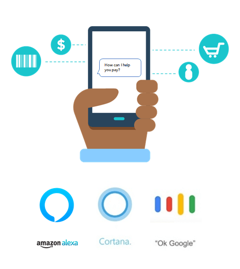
The growth and adoption of VUI owe to the increased use of voice commands as a way to interact with phones. The fast-evolving nature of technology has catapulted VUI as a trend in modern website UI design.
Some primary factors driving the adoption of this trend include the idea that “speaking is natural, and typing is invented,” while technology diffusion is unstoppable from opening a door using voice commands to ordering food online.
Third, VUI is highly favored by people with visual impairments who can rely on their voice to run applications and perform tasks without the need for visual user interfaces. Additionally, search engines will favor websites that comply with the ADA Website Compliance standards.
Stats indicate that about 39.4% of American internet users use a voice assistant at least once a month. Brands leaning into this trend include Cortana by Microsoft, Amazon’s Alexa, and Google Assistant.
Typography
Users often scan website information as opposed to reading and are highly likely to associate specific fonts with certain brands. Therefore, choosing the correct font remains among the most critical aspects of UI design.
Selecting an appropriate font gives a website a fresh and entertaining appeal. Likewise, good typography helps users to identify and locate important information on a website.
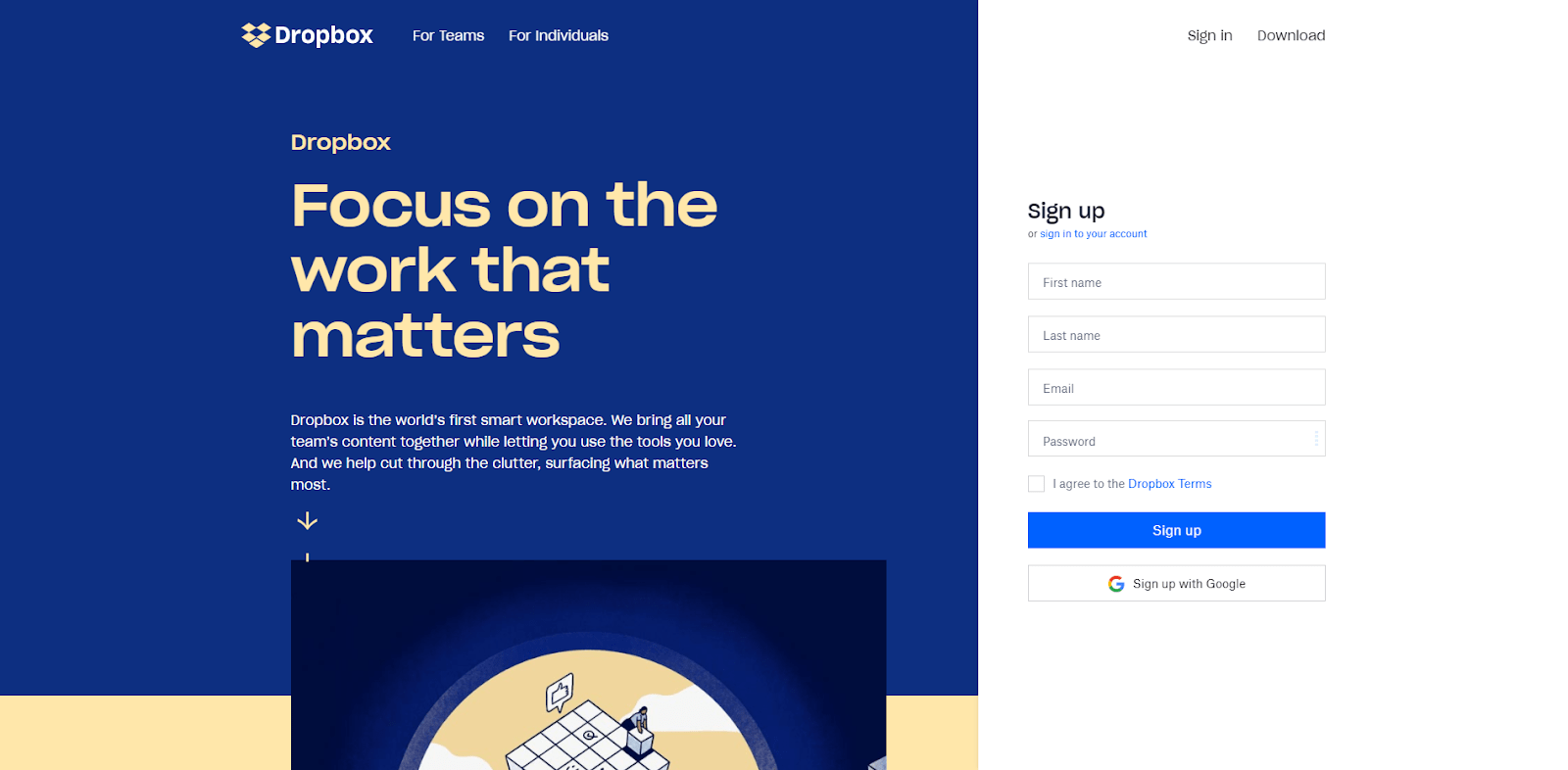
Web designers often deploy typography that can convey information to customers concisely. Many websites use bold typography, which can easily grab the attention of users because it distinguishes itself from the surrounding elements and is easy to read.
Notable brands using bold typography in their website UI design include Drift, Dropbox, and Nike.
UX/UI Trends Need to Serve Your Audience
Your website is the face of your company. It builds credibility with potential customers and can be the deciding factor in whether or not someone wants to work with you. Business moves at the speed of trust, and our teams work with you to make sure that your users trust and want to work with you. By understanding what your company does, we are able to craft seamless digital experiences for your users by understanding the value you offer.

