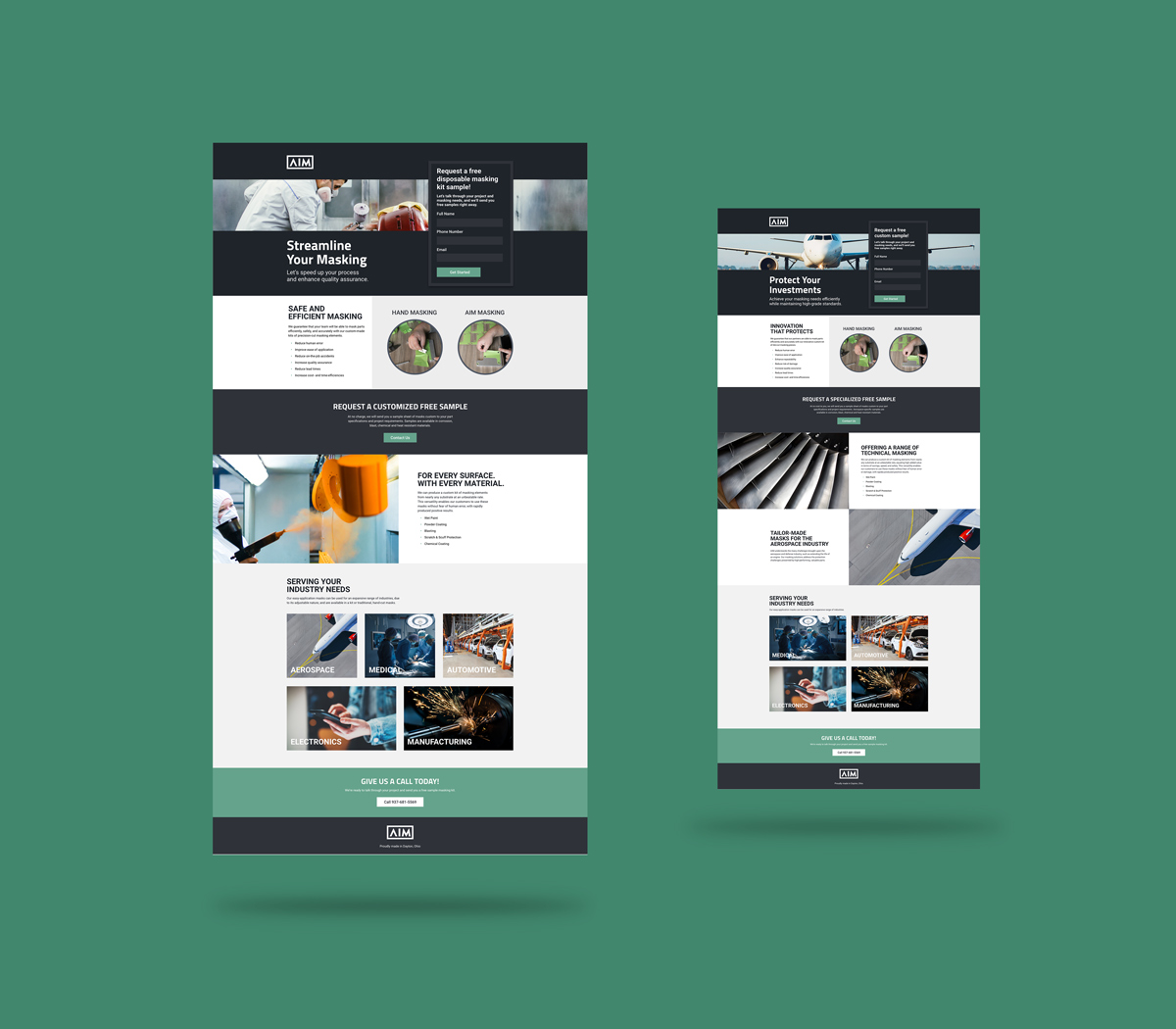
The phrase landing page is thrown around quite a bit – and for good reason!
Well-designed and optimized landing pages increase search visibility, increase a brand’s credibility, and further nurture building relationships with potential leads.
While a poorly-designed landing page can…well, you know, cause you to lose leads, money, and a lot of wasted time. Of course, it can take a bit of tweaking, reviewing, and adjusting before a landing page is the best it can be.
Let’s review some key landing page statistics that will help outline landing page best practices you should implement in your next project.
Get To Know Landing Pages
1. The most popular landing page is a squeeze page.
A squeeze page has one goal in mind – to get a user’s email address.
An email list unlocks the door to nurturing leads. You can send your best content and offers straight to your audience’s inbox.
Most squeeze pages offer a free ebook or newsletter to convince viewers to enter their email.
2. Contact form landing pages typically have low conversion rates.
Contact form landing pages ask for personal info – your phone number, address, email, etc.
It’s easy to click the backspace button when you’re asked for this type of info…hence the low-conversion rate.
3. 48% of the top landing pages are ranked in maps and organic listings.
Let’s break down this landing page statistic into two parts.
One, almost half of the landing pages are ranked in maps.
Most landing pages reach out to their local area. They make it easy for local customers to find their business.
Two, most landing pages are ranked in organic listings… aka, organic search.
Landing pages can contribute to your SEO. Input keywords to rank high on Google.
4. Creating a landing page can cost anywhere from $75 to $3000.
You pay for what you get. The costs of a landing page depend on a couple of factors.
- Are you creating your page in-house? Or are you outsourcing?
- Are you using PPC advertising? Or organic?
5. According to Unbounce, landing pages are in the middle stage of your marketer’s funnel.
Landing pages nurture leads into customers.
Once customers learn more about your business through social media or email, they’ll feel more comfortable with your business… and will likely convert.
6. 77% of the top landing pages were home pages.
Landing pages and home pages aren’t the same.
Homepages tell readers about your business. They welcome viewers to learn about you.
Landing pages are direct. They have one goal and one goal only – to convert.
Make sure your home page and landing pages aren’t doing the same job. Diversify your marketing funnel to get more conversions.
7. 52% of marketers reuse landing pages for different marketing campaigns.
The highest converting landing pages are niche-driven. They target a specific audience about a specific topic.
Avoid reusing landing pages for different marketing campaigns. Instead, create a variety of pages. Or, build a dynamic landing page (we’ll discuss this type of landing page later in the article).
8. 8 out of 10 people will read your headline, and only 2 out of 10 will read the rest.
Your headline is created to hook your readers right away – they should want to know more about you.
Bottom line, your headline is VERY important.
9. Personalized CTAs convert 202% better than a normal CTA.
Imagine this.
You just got a new puppy and want to buy flea medicine.
You come across a business that offers an online subscription for flea medicine.
What CTA sounds better to you?
“Sign Up!”, or… “Get your first dose of flea medicine for free!”
The second CTA gives an incentive and is more personal than, “Sign up!”
You get the point – create a personal call to action for your targeted audience.
10. Pages designed for cursory reading are more likely to be read.
Cursory reading means scanning a page.
Most online users don’t read every word on a webpage – they only want the main idea.
Use bullet points, short paragraphs, and an active voice to help readers scan your landing page.
11. 86% of the top landing pages are mobile-friendly.
Why this is not 100%…we don’t know because in this day and age, being mobile-friendly is necessary.
A mobile-friendly landing page is easily accessible through a phone. And they load fast.
Plus, there are many landing page tools and WordPress plugins to help you create a mobile-friendly page.
12. Almost half of online users look for videos related to a product before they visit a store.
Watching a video about a product is fast and easy to understand.
You can describe your product in much better detail using video… AND it’s a great way to deepen your brand.
Add a video to your landing page to describe your service. Make sure it aligns with your landing page goals.
13. 46% of marketers consider form layout to have a significant impact.
The layout of your landing page is extremely important.
The goal of your layout is to guide users to your call to action. A/B testing will help you find what layout works best for your audience.
14. 16% of landing pages don’t have a navigation bar
This is a much lower number than it should be.
Navigation bars distract users from your CTA. It invites them to go elsewhere.
The highest converting landing pages get rid of distractions – navigation bars and clickable links are a couple of examples.
Guide your audience to your call to action and keep them focused on the prize.
How Do Landing Pages Perform?
At this point, you can probably guess the main goal of a landing page – to convert users into customers.
The real question is, what converts users? Let’s find out.
15. The average landing page conversion rate was 4.02%.
This number seems low, right? Good news, this number is just an average across all industries.
16. Conversion rates can increase when you use emotions such as awe and laughter.
This study was found after researching 10,000 different articles. Basically, we want to feel good when we buy something.
On that note, users want to buy products from interesting and positive businesses.
Incorporate positive emotions to your landing page using video, visuals, and great copy.
17. A two-second delay in webpage load time can increase your bounce rate by 103%.
Let’s cut to the chase.
Your landing page needs to load. And it needs to load fast.
18. Websites with 40 or more landing pages generate 12x more leads.
Lead generation is a numbers game. The more you create, the more leads you’ll get.
This doesn’t mean you have to create 40 landing pages at this moment. But creating more landing pages can benefit you in the long run.
Make landing pages a priority within your marketing funnel. It’ll pay off.
19. Using the word, “submit,” as a CTA can decrease conversion rates by 3%.
This study shows how to direct language can steer your audience away.
Avoid typical calls to action and personalize them instead. Your audience will feel more comfortable with signing up for your service.
20. It’s most optimal to have 3 form fields on your landing page.
Privacy is important to most, if not, all users.
Think about it… when you’re asked to fill out a bunch of personal information, how likely are you to do it?
Another interesting part of this data is how conversion rates for 2 and 4 form fields are low. It seems like users trust the number 3.
21. Asking for an email and phone number has the highest conversion rate.
These findings are something to test out for your own landing pages. Some audiences prefer giving out their phone number, and others don’t.
Notice how email is included in every combination. Remember, a user’s email is the perfect way to send out relevant content – just DON’T SPAM.
How To Improve Your Landing Pages
So you’ve created your landing page. Now what? Test, adjust, improve, evaluate.
22. Only 17% of marketers use A/B testing to improve landing page conversions.
Your landing page will only get better if you know what works and what doesn’t.
A/B testing isn’t the only way to improve your landing page, but it’s great at telling you what converts.
23. Call-to-action buttons have become the most popular website element for testing.
If A/B testing helps boost conversion rates, then it’s no wonder why calls to action are the most popular element to test.
Personalize your CTA for your targeted audience and test it out. You might be surprised at what you find.
24. 1 out of 8 A/B tests have driven significant change
Your results can be affected if you’re testing multiple features at once.
Test one feature at a time for at least a couple of weeks. You’ll get a better understanding of what converts.
25. Your overall spending on marketing campaigns can decrease with A/B testing.
Like I mentioned earlier, A/B testing can be a serious money-saver. There are a couple of things you can do to get the most out of your investment.
First, start as soon as possible. Think of hypotheses about your landing pages as you create them. You can test this out as you go along.
When you speed up the process, you’ll get higher conversions faster.
Second, be precise and test out one feature at a time. You’ll get more accurate results.
26. 7% of companies believe it is very hard to implement A/B testing.
A/B testing is valuable, but it’s not always easy.
To get the most out of it, you’ll have to do your own research before you test.
It isn’t a short process, but it’s a valuable one.


