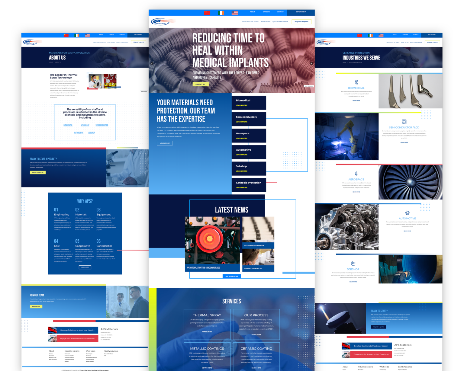
The do’s and don’ts of web design aren’t always as cut and dry as you’d think.
I’m continually surprised by how many people start meetings with our team with very firm ideas about what they want on their website and yet, haven’t thought through some of the most basic questions first.
For this reason, our first question is always, “Why do you need a site?” Not, “What do you want on it?”
Your website is a marketing tool. For many businesses, it’s their only source of business. If done right, it can be a major part of yours. Here’s a quick-hit list of the top do’s and don’ts of web design before you get started:
Web Design Do’s
- Set smart goals. And make sure they’re measurable. Here are a few great ones a Web designer wants to hear: increase conversion rates, increase sales, generate more leads, reduce overhead, and improve brand awareness.
- Study up on SEO best practices and trends. Sure, you’re going to want help from the pros, and eventually, you might even need your own in-house SEO expert, but search engine optimization is something you need to know about too. It has one of the highest ROIs in marketing. SEO can literally put your marketing on autopilot, allowing you to focus on improving the quality of your business, instead of figuring out how to bring in customers to your site. Countless tools are available like SEMRush, Moz, and Google Keyword Planner to get you started,
- Use open-source tools. You could go with a proprietary content management system (CMS) but that means you’re typically stuck with one company and paying hefty license fees to boot. Do yourself a favor and go with an open-source system- We like WordPress and Magento that any developer can access.
- Plan for mobile usability. Let’s be real. The percentage of people that will likely visit your website is high. And if you do research and it is high, you may want to consider building a separate mobile version of your site, or even an app. If the off-chance it’s relatively low, just make sure your website works on a smartphone.
- Research your competitors.
 Before you build your site, check out your competitors and note things that they do well. It’s completely acceptable to use this as inspiration for your own site. Why do you need to reinvent the wheel?
 - Develop your content. Content takes FOREVER, and clients are usually the ones holding up the process. If you’re going to sell products on your site, get product photos and product descriptions ready. If you sell services, you’ll need a description of each service. Get as much of your content together before you start building your site. This will save you more time and energy than you realize. And while you’re at it…
- Keep call-to-actions at the top of your mind. Good calls to action direct visitors to a specific action and keep them from bouncing immediately. Have a big sale? Don’t just write a banner that says “50% off all products.” Write one that says, “50% off all products, CLICK HERE to view them.”
- Always answer the question: “Why?” Have you ever walked up to someone you’ve never met, handed them a business card, and walked away without saying a word? Likely not. If you want people to do something on your website, such as sign up for your newsletter, don’t just put up a button that says, “Sign Up,” without context or something convincing. You need to provide some sort of value; tell them why it will benefit them to take that action.
- Trust the experts you hired. Strategists, designers, copywriters…they only want the best for you. I tend to see the worst end results with customers who come in with an attitude saying, “I know what I want, just do what I tell you.” You hired an expert because they know more than you, right? Let them do what they do best and they’re more likely to meet and often exceed your goals.
Web Design Don’ts
- Do it yourself. While yes, a marketing agency is writing this post, so of course, this was going to be stated. But seriously, your website is often where your customers first experience your brand. If it looks homemade, they’re going to make assumptions about the expertise, professionalism, and quality of your brand.
- Make people think. When visitors come to your website, they typically already know what they want out of it. Do a three-second test: If within three seconds a visitor can’t figure out a path to what they need, rethink your strategy.
- Expect good traffic. Lose the “If you build it, they will come” mentality. Slapping a site on the interweb will not attract visitors – especially not the right visitors.
- Spend all your money. Dont max out your entire budget on the website. You can get a well-designed site for under $2,000 from a freelancer, or a few thousand dollars from a professional agency. And you can always make improvements as your business grows. Its far more important initially to have some money left over for a marketing budget so you can actually make a return on your investment.
- Include a blog. Are you really going to keep a consistent posting schedule? If you won’t – because it is a commitment – then forget about a blog. An outdated and sparse blog can indicate a lack of commitment and/or that your business is no longer functioning well.
- Add social media icons (sometimes). If a potential client visits your social accounts and sees little effort, they may lose trust in you. Be strategic about which social platforms your business utilizes and take the time to build a decent following with solid engagement.
- Try to appeal to the masses. Your website will be a mess if you try to accommodate every type of visitor who might come along. Figure out who is likely to be your most frequent users and focus on creating the best experience for them.
- Add generic testimonials. Building credibility is important, but too often testimonials sound fake. Choose successful projects with clients you have a good relationship with and build a case study!
- Use Flash. Some sites still need it, but if you can, avoid it. Adobe just announced that it will no longer support Flash on mobile devices and set-top boxes. The last thing you want is for a potential customer to be unable to open your site.
- Expect to knock it out of the park. Give yourself time – a lot of time – to build a great website, and do not expect to reach perfection immediately. Websites take building, evaluating, adjusting, and monitoring. Patience is a virtue.
Welcome To Wilderness Agency. We’re Glad You’re Here.
Strategy before design.
That phrase is more than just a slogan. It’s an aggressive approach to landing your pages in front of the right eyes. Your website should do its best to make an entrance any time your services are queried or keyed in.
Strategy before design is a promise. A working promise that your web design will put your desires and needs as a business first. A great web design means nothing if you’re not hitting the intended markets. What good is all the interest, if you can’t turn it into a working relationship with your customers you want?
Ready to start a project?


