The best practices of UX & UI are ever-changing. So can we even determine what best practices should be implemented in nearly every site?
The short answer: Yes, it’s possible. Here is a brief review of the ten best practices of UI & UX that we follow every time to ensure attractive design and basic usability.
User Interface (UI) Best Practices
#1 – User-Focused UI
One of the most important best practices when designing a user interface is to ensure it is user-focused.
It is important to ensure users are top of mind when conducting research and designing the UI.
How to Implement
To ensure the design is user-focused, it is important to get into the mind of the user.
Ask questions such as what do the users want to accomplish? How will the application make it easy for them? Then list out the goals and refer back to them throughout the UI design process.
According to Adobe, to ensure a user-focused design, the design process should follow the following path:
- Understand the context of its use
- Specify user requirements
- Design a solution
- Evaluate against requirements
It is important that the steps are research-based. It involves research to define and create user personas and map the user journey.
Understanding the context of use and the various use scenarios and designing a solution that takes all that into account is also vital.
Observe how users interact with the product and further improve or retweak the design.
#2 – Make User Interaction Easy
Another best practice when designing a user–centric UI is to ensure user interaction is easy. The goal of UI is to make it as easy and quick as possible for users to do and find what they need.
How to Implement
Eliminate all irrelevant elements in the UI that do not help users.
According to Adobe, “strive to design UI in a way that all information presented on the screen will be valuable and relevant. Examine every element and evaluate it based on the value it delivers to users.”
It is important not to ask users for information they have already entered as users generally hate data entry. A well-designed UI does the maximum amount of work possible while demanding minimum input from users.
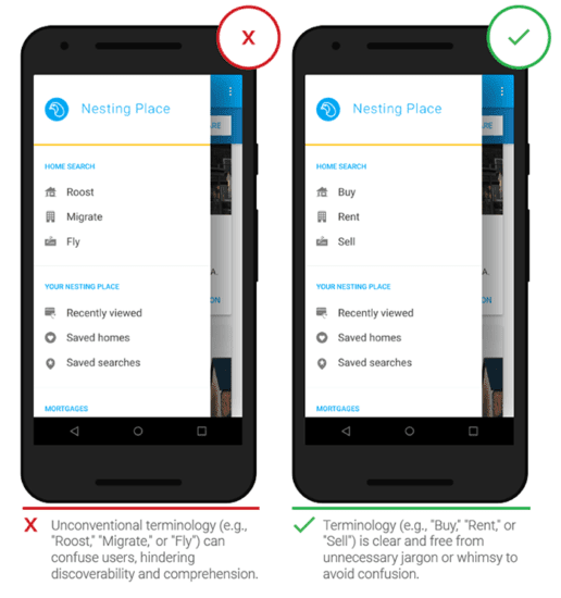
Use simple language that is easy to understand and avoid using industry jargon and system-oriented language.
Apply Fitt‘s law which states that “the time to acquire a target is a function of the distance to and size of the target. This means that it’s better to design large targets for important functions (big buttons are easier to interact with).”
Allow users to easily navigate the UI with shortcuts.
Ensure the design is accessible “to users of all abilities, including those with low vision, blindness, hearing impairments, cognitive impairments, or motor impairments.”
#3 – Reduce Workload and Establish Design Pattern
A good UI enables the user to perform tasks with a minimum number of steps.
If an action that requires four actions can be done with two steps, the UI should always be modified to follow the shorter task flow.
How To Implement
Reduce the number of steps needed to complete each action.
Make it easy for users to recognize a step or action rather than having to recall it. “Designers can promote recognition in user interfaces by making information and functionality visible and easily accessible. Visual aids, such as tooltips and context-sensitive details, also help support users in recognizing information.”
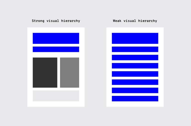
Having an established design hierarchy helps facilitate UI consistency. When it comes to visuals and the human eye, some elements take precedence over others (bigger sizes, bright colors, etc.), depending on how “noticeable” they are. Whether users are aware of it or not, they instinctively pay attention to the order and priority of the elements they interact with.
#4 – Consistency
Consistency is essential for good UI because a consistent design is an intuitive design.
According to Adobe, “consistency is one of the strongest contributors to usability and learnability.”
Consistency also enables users to transfer their skills and knowledge from one part of the app to another part of the app or another platform of the same brand.
How To Implement
It is important to be consistent with the overall brand. Typography, logo, correct image styles, brand color schemes, etc., should be reflected in the application, just like the rest of the brand’s properties.
Functional consistency is also important. Objects, buttons, and icons should work the same way consistently throughout the app.
It should also be consistent with user expectations. Users have expectations of the platforms they visit. Hence, platform conventions should be respected, and designers should not reinvent patterns or terminologies.
#5 – Provide Feedback
Providing feedback to users when they take a step is essential.
Users shouldn’t have to wonder if an action taken produced the desired result or not.
How To Implement
The feedback should be provided via readable UI copy.
According to Ben Shneiderman, well-known author of Designing the User Interface, “for frequent and minor actions, the response can be modest, whereas for infrequent and major actions, the response should be more substantial.”
For example, when users are asked to create a password, they should be given feedback on the strength of the password.
UX Best Practices
#1 – Research Is Essential
Research must be done to constantly reassess UX best practices. It is important to understand the user and provide insights on user–centric UX design.
Good UX research helps align product development activities with the users’ needs at every stage of the design process.
How To Implement
Depending on the stage in the design process, UX research implementation may or may not include the following steps:
- Requirement gathering
- Diary study
- User interview
- Design review
- Competitive analysis
- Journey Mapping
- Benchmark Testing
- Survey
- Search-log analysis
- FAQ review
#2 – Understand the User’s Needs
Designers often assume they know or can predict the user’s needs or assume that those who will use the product are like them.
It is important for designers to remember that they are not the user and test their products with actual users.
How To Implement
It is important to test as early as possible as it is easier to make changes at the earlier stages of development.
Before starting testing, it is important to be clear about the objectives and the goal of testing.
Once the objectives have been defined, you can now define which tasks will be tested in order to answer the questions or validate a hypothesis and/or assumptions.
The goal of the test for the designer is not to test the functionality itself (that should be a goal of the quality assurance team), but to test the experience with that functionality.
It is important the tasks designed for the test are actionable and with crystal clear instructions for the testing subjects.
#3 – Design for Short Attention Span
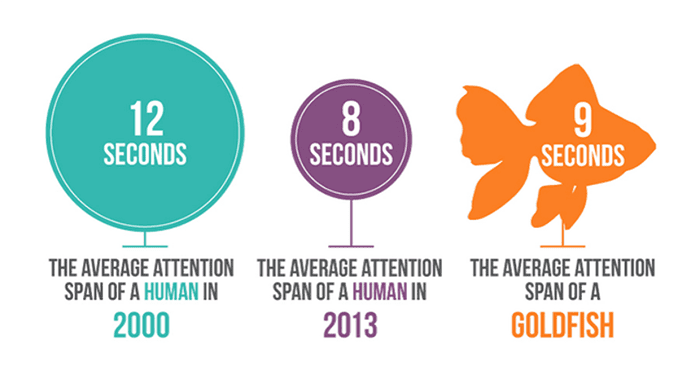
Attention span is about how long a user concentrates on a given task without being distracted.
According to a study by Microsoft, the average human attention span has declined from 15 seconds to 8 seconds.
How To Implement
Aim to get people the information they need as quickly as possible.
Simplify the interface by removing unnecessary elements or content that is not necessary to accomplish the user task.
It is important to use the negative (white) space appropriately. Negative (or white) space is the most important feature of minimalism and gives it much of its power. Negative space is just the empty space between visual elements. More empty space means more emphasis on existing elements.
#4 – Flexible UX Process
UX process is an essential aspect of design. A clear and concise UX design process makes it easier to build amazing experiences for users.
It is essential that the user design process is flexible to fit the need.
Although many designers think that there’s a single universal UX process that can be applied to all UX design projects, there’s no such thing as a one-size-fits-all UX design.
Flexibility also entails designing to accommodate the needs of different users, such as expert and novice users.
How To Implement
Each project is different and has its own subtleties and needs. Hence, a UX design process should always be selected based on the project requirements.
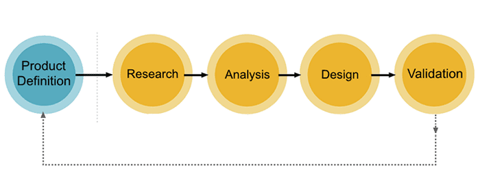
The above picture depicts the general UX design flow. However, some tasks may warrant starting from a different part of the flow or spending more time on certain aspects than others.
For example, if you are designing a new product, you might need to spend more time on user research and requires clarification. But if you’re redesigning an existing product, then you might need to spend more time on design validation (conducting usability and A/B testing, or working with analytics reports).
According to Nielsen Norman Group, designers “should prioritize flexibility and efficiency of use through the use of shortcuts and accelerators — unseen by the novice user — which speed up the interaction for expert users. This approach allows a system to cater to both inexperienced and experienced users.”
#5 – Use Prototypes
Prototyping is about creating a minimum viable product (MVP); a version of your product with enough features to allow your first users to test it and offer feedback.
The goal of creating prototypes is to test the design hypothesis before spending time and resources building the actual product.
How To Implement
Prototyping is time-consuming, and as such, features to be prototyped have to be decided upon.
The most important elements to prototype are the core functionalities and features in the app.
Prototype novel interactions and patterns that are not common in other apps users are used to when they will be introduced in the products.
It is important to collaborate with the technical team when creating prototypes and to test the prototypes with real users.
It is vital that the prototypes look as much as possible to the actual products by using graphics, content, and buttons that will feature in the actual product.
Built To Convert
Your website is the face of your company. It builds credibility with potential customers and can be the deciding factor in whether or not someone wants to work with you. Business moves at the speed of trust, and our teams work with you to make sure that your users trust and want to work with you. By understanding what your company does, we are able to craft seamless digital experiences for your users by understanding the value you offer.


