The function of design is letting design function. +Micha Commeren, designer
UX trends change as behavior changes.
However, it can also go the other way. Design is meant to drive action. An action can be as drastic as the visitor making a purchase or the visitor leaving immediately. An action can also be as simple as scrolling to read more and staying to watch a video.
Having an attractive, unique, and user-friendly design on your website, app, or advertisement can make all the difference. We want to, ultimately, convince them to dedicate more of their time to learning about your product or company.
Over times of great social change like 2020 and 2021, UX trends tend to emerge that keep people interested and engaged.
As technology needs and wants evolve, here’s what we’re looking forward to what UX trends may emerge in 2022.
Four Favorite UX Trends
Minimalistic Designs
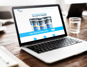
While having a recognizable or eye-catching design is certainly important, it can be difficult to balance form with function. If the design is too cluttered or overwhelming, it can disorient people or make it more difficult for them to find what they’re looking for.
Every day, consumers are overloaded with ads everywhere and a fight for their precious attention. They interact with different interfaces that are overwhelmed with information.
To reduce information overload, web designers are always searching for new ways to make graphic elements simpler. They limit the number of colors, try different proportions, experiment with compositions, and reduce unnecessary graphics.
In order to avoid situations like that, many companies have been moving to simpler, more streamlined designs to tailor their user’s experience.
A great example of this is Google, which has recently changed the logos for their individual apps, making them a much more streamlined and uniform design. This simplicity helps users to clearly recognize a specific Google app when they see a distinct color pattern.
Keep in mind that like all good things, you should use simple designs carefully. If your interface becomes too simple without a clear brand differntiator, it could bore people, or give them the impression that you haven’t put enough effort in.
Strive to strike a balance between simplicity and attention-grabbing.
Bold Fonts
Font choices are crucial if you want your text to be more than words on a screen. Whether it’s bold, stylized, or straight-forward, it needs to be strategic to make a difference.
Every designer knows how important it is to choose the right font for a website, product, or application. Customers often associate a particular font with some big brand. Nobody would use Roboto if it wasn’t for Google. The Internet giant created this front and showed it to the whole world.
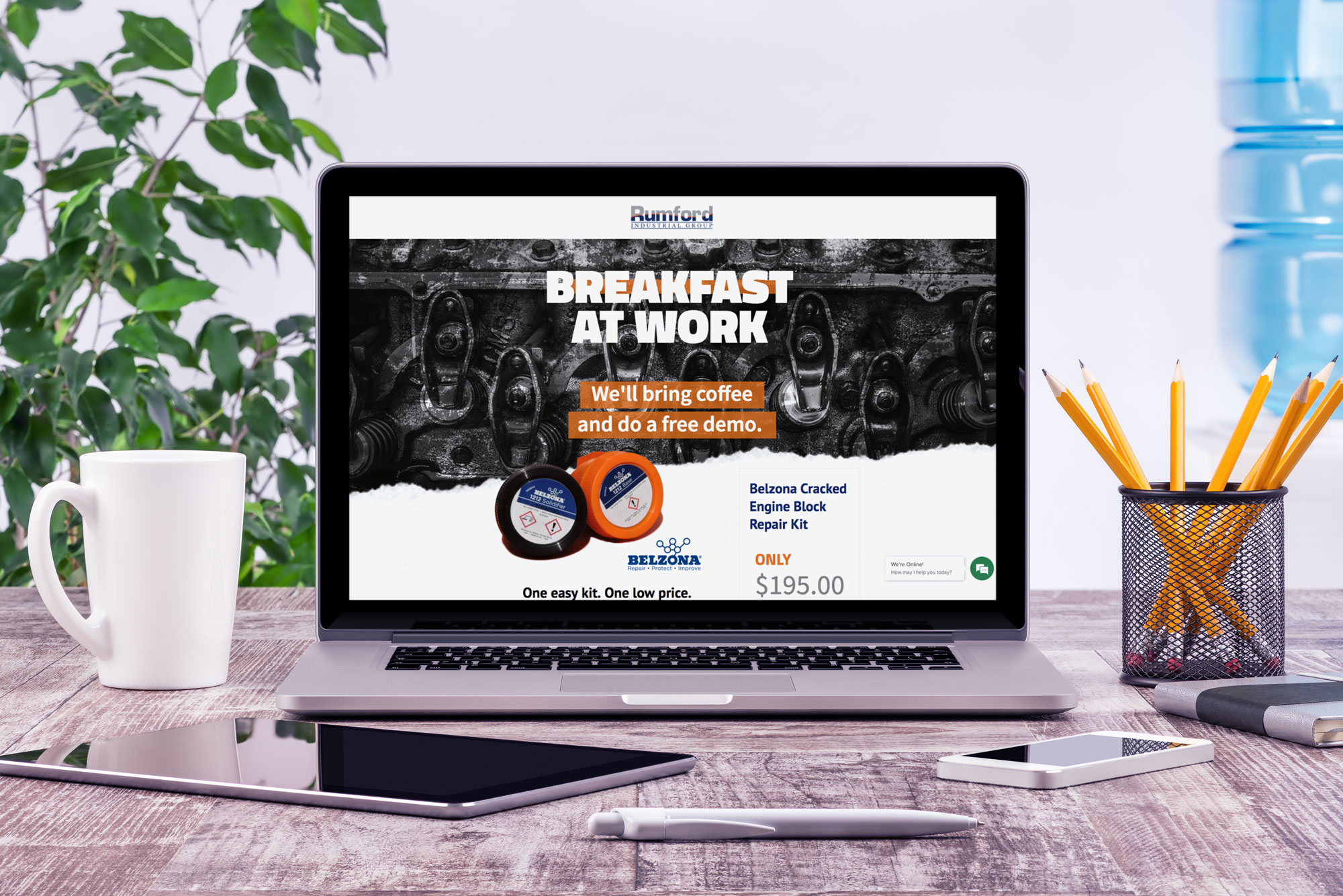
Many user interfaces will incorporate unique, thick, flashy fonts for what they feel the user should focus their attention on.
This is a clever way that designers can guide users and help direct their experience in a more predictable fashion.
Usage of this type of font has been steadily increasing for a while now, and I see no reason why it would slow down. It’s a useful method to catch someone’s attention in a way that does not require a huge amount of effort to pull off.
Expressive Colors
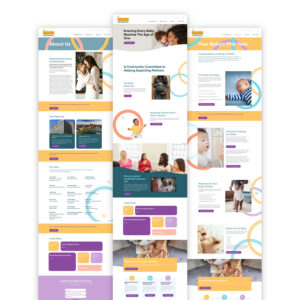
Website designers know they need to evoke certain feelings in their visitors to achieve the right action. Something that they can pass along to users through the design, whether that be a certain feeling they want to be associated with their brand or an idea.
A designer can persuade feelings and actions through expressive and directive colors in your site’s design. If you want people to feel energetic use oranges, reds, and yellows. If you want someone to feel happy, utilize light blue, green, or pastel shades.
Anecdotal research has been gathered on how certain colors are associated with specific emotions and are even capable of eliciting those emotions. The scientific community is slowly gathering hard data to further dissect the power of colors when it comes to psychology.
Your feelings about color are often deeply personal and rooted in your own experience or culture. +Kendra Cherry
The best part is people tend to associate memories with emotions, so if a good UX can make people feel the way you want them to, your business may stay closer to the forefront of their mind
User-Triggered Animations
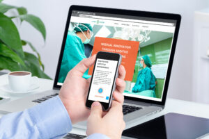 Last, but certainly not least, properly implemented animations can bring that extra spice to your interface. Do you agree that there is just something satisfying when your selection slides onto the screen, rather than abruptly loading?
While the general purpose of design is communication and the transfer of information, digital design can accomplish digital interaction and the collection of feedback. These moments in which a user takes an action—such as clicking on a button—that causes the page to respond, are generally referred to as micro-interactions. Their purpose is to foster a feeling of visual/tactile satisfaction.
Designed to go beyond entertainment, animations invite your user to keep playing with different features throughout the site. More time spent on the page = more likely to complete a measurable action.
And with technology always improving, and learning courses becoming more accessible for people who are interested in learning how to animate, I can see animations becoming an even more popular aspect of UX.
Tell Your Story
Good digital design is all about making sure that a user can easily see and understand the information you are presenting. Our user-focused design process helps to make sure everything on your website looks great, and most importantly, gives your customers the information they are looking for. Learn more about Wilderness Agency’s design services.

